The Westwood
Brand Identity / Print / Advertising
The Westwood is a luxury real estate development that is being built in Downtown Vancouver beside False Creek.
The developers wanted to create a prestigious brand that reflected the exclusive neighborhood that the residences are being built in. The goal was to attract a mature, wealthy demographic through a sophisticated, unforgettable visual identity.
The Concept: The creative direction mimics the clean, modern feeling of the residences themselves. The strong green colour is carried throughout all the brand assets and visual interest is created by adding elements of nature which remind people of the lush False Creek oasis in the middle of Downtown Vancouver.
The Westwood has a simple logo that is clearly visible on a diverse range of marketing assets. The logo font is elegant and features a strong “W” which works as a distinguishable monogram. The green and yellow are serene and graceful, further emphasizing a natural aesthetic. The secondary font has a more approachable tone so that the brand still feels inviting.


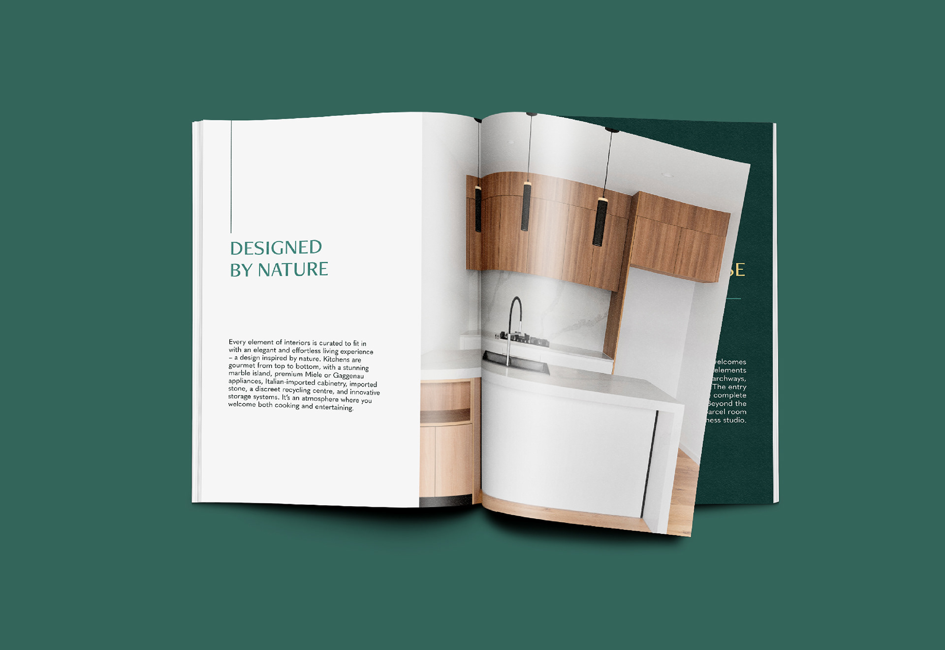
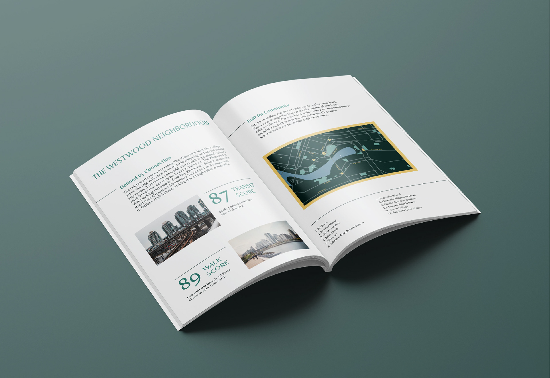
The layouts feature minimal text so that the imagery and important information is highlighted. The use of lines help guide the reader through the composition and further highlight important information.
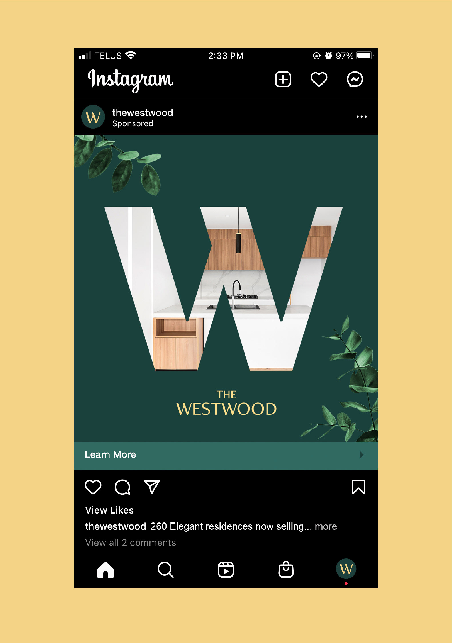
The ads continue the refined aesthetic of the brochure layout, but add imagery and graphic treatments such as overlays and clipping to capture the interest of viewers in a saturated real estate market.
The hoarding provides an elevated feeling to the construction site to ensure people walking by are intrigued by the new development.


Programs Used: Adobe InDesign / Adobe Photoshop / Adobe Illustrator
Images provided by unsplash.com
