Oxygen
Brand Identity / App Design
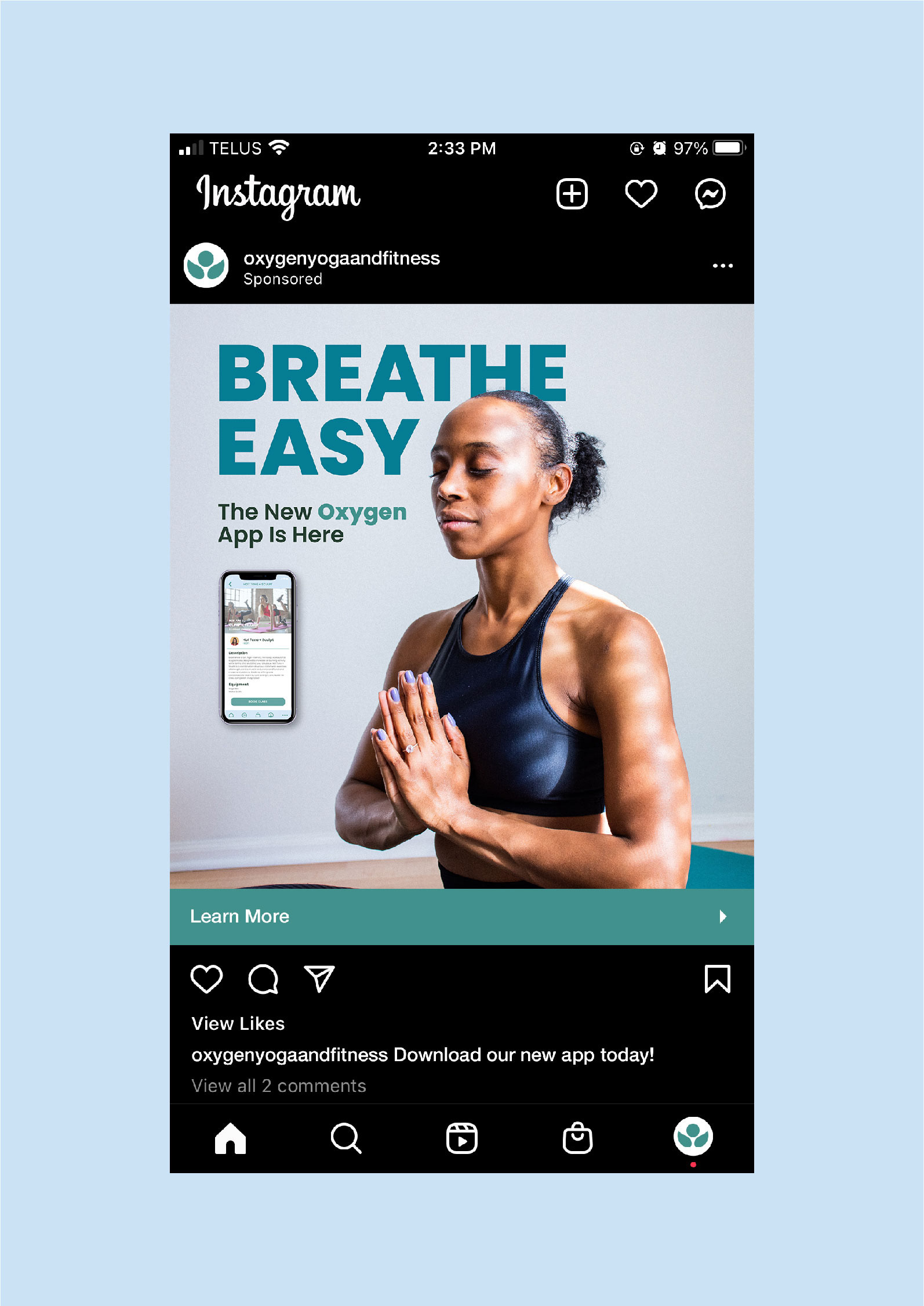
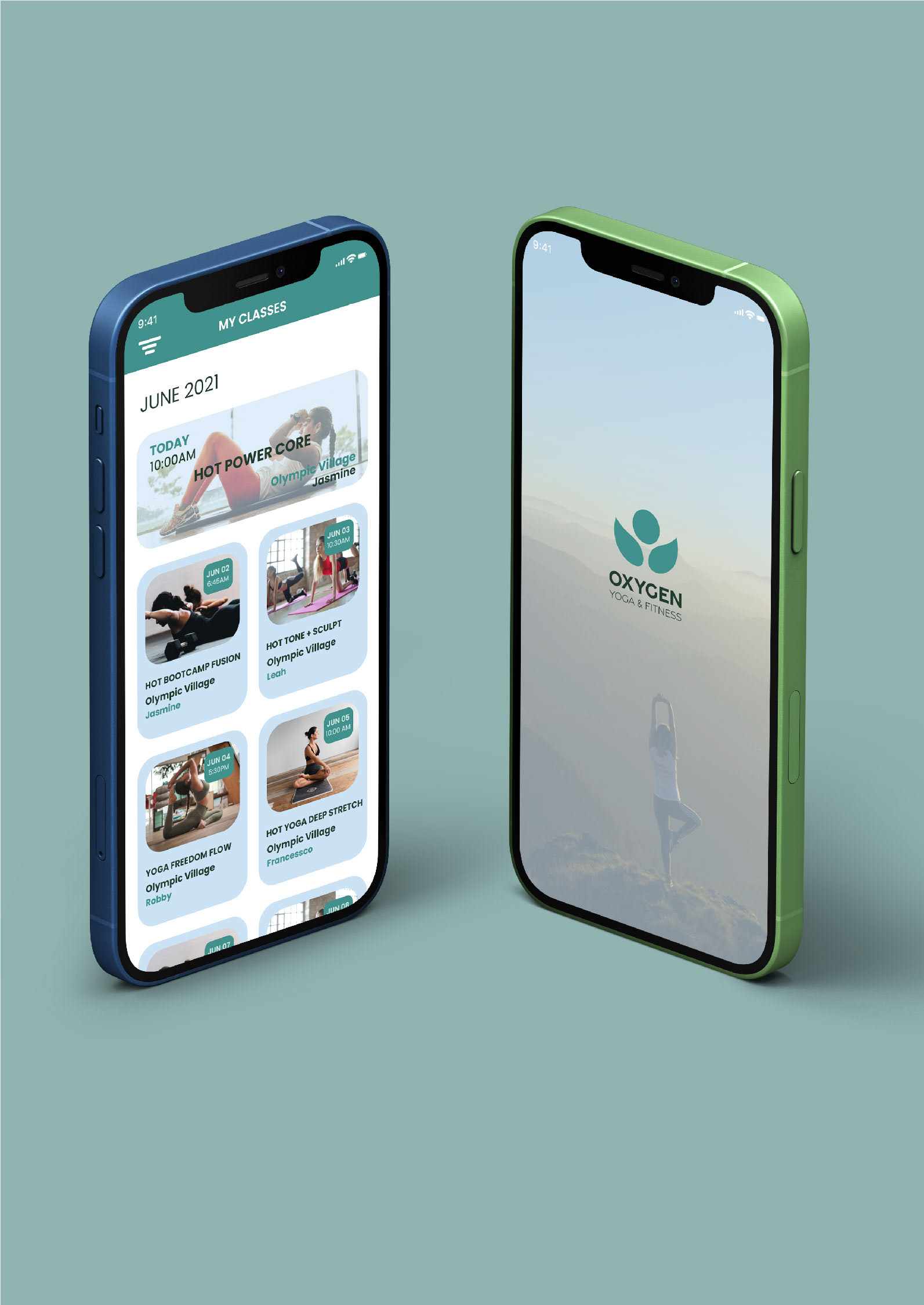
Oxygen is an infrared hot yoga and fitness studio with locations across Canada. They promote self love and personal health. The studio has their own mobile app that allows users to search studio locations, book classes, and manage their workout schedule.
This design study focused on redesigning Oxygen's existing mobile app to give it a more modern, user-friendly interface. While content could be repositioned on the screen, it could not be removed, changed or added.
The Concept: The app needed more visual interest, updated colours, and a new modern design that displayed information with more hierarchy. We created a cleaner layout, updated icons, consolidated menus and added rich imagery to give the user a more engaging experience when using the app.
Oxygen currently has two brand logos. The green and blue logo is their original logo found on their website, app, and in studios. The black logo is newer for the brand and can be found on their recent Instagram posts and in some images on their website. The green and blue logo is outdated but the newer black logo is impersonal and doesn’t properly represent the brand behind Oxygen Yoga and Fitness. Having multiple logos is also confusing for consumers and doesn’t create a strong brand identity. We wanted to combine elements of these two logos into something more appropriate.
The new logo has several aspects of the current logos but in a more modern, elegant way. The circular shape and two leaves from the original blue and green logo is updated and combined with a clean sans serif font resembling the black logo. The new symbol is an abstract depiction of someone inhaling their arms up over their head. This is something done in almost every Oxygen class, both yoga and fitness. The new colour palette is an updated version of their original green and blue, giving it a more contemporary feel.


Programs Used: Adobe XD / Adobe Illustrator / Adobe Photoshop
Images provided by unsplash.com
