Label
brand identity / layout
Label is a new fashion magazine that is in development. The magazine needs typography that works well against bright colours and rich imagery. The goal is to launch this magazine with strong, modern branding, striking imagery and interesting article content. The magazine design should be adaptable to print and digital formats and appealing to a variety of audiences
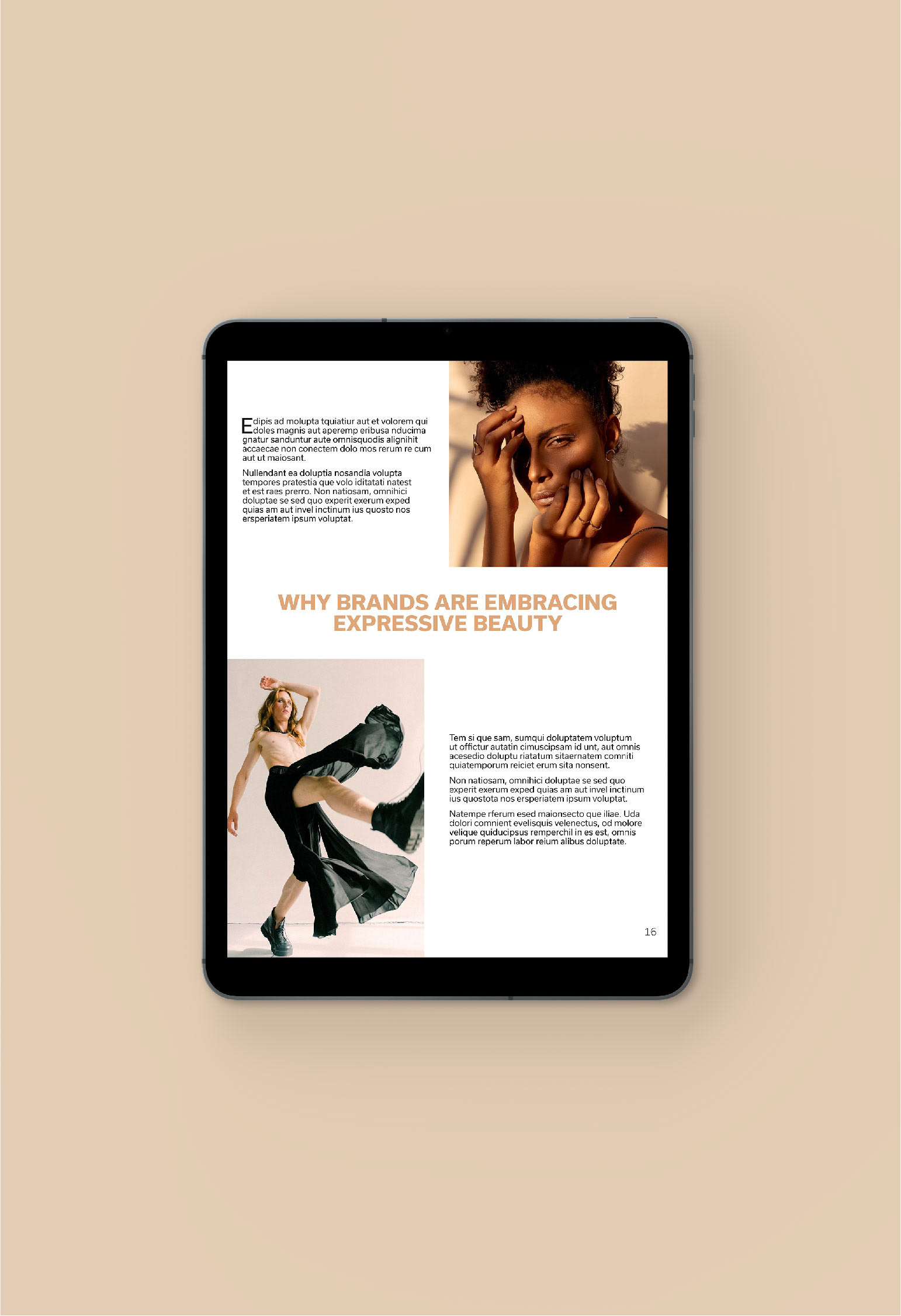
The Concept: The layout is bold, colourful and modern. It uses lots of open space and rich imagery to draw the reader in. The focus of the magazine is on the photography and spreads often follow a slightly monochromatic theme.
To continue the minimal, modern feel of the magazine, Label carries the same font throughout the entire magazine. When selecting typography for the project, it was important that the family chosen was a clean sans serif that could work with any image, and that had many weights. Usual is a wide sans serif with little to no contrast. It is strong but neutral, allowing the imagery and content to be the main focus. The colour palette for this magazine varies issue by issue, but is always bold and colourful. The colours are selected from the imagery chosen. The brand name on the cover is not in colour, but rather clipped into the cover image.
The layout for the magazine is minimal and timeless. The spreads use lots of negative space to allow the strong imagery to shine. Articles follow a monochromatic theme that matches the photographs.
The digital layout needed to be able to adapt to different screens. The composition was left relatively as is for the tablet but was rearranged to a vertical layout for the mobile version. All images, quotes, headlines and content remained the same.


Programs Used: Adobe InDesign / Adobe Photoshop
Images provided by unsplash.com and pexels.com
