Juniper
Brand Identity / Packaging / website
Juniper is a new brand launching with three thoughtful self-care products. The brand believes that taking time for yourself is more than just encouraged- its necessary.
The goal was to create an identity that pushed the boundaries of what you envision a typical “self-care” brand to be. Juniper wanted to position themselves as the new go-to brand for the younger Gen-Z and Millennial demographic.
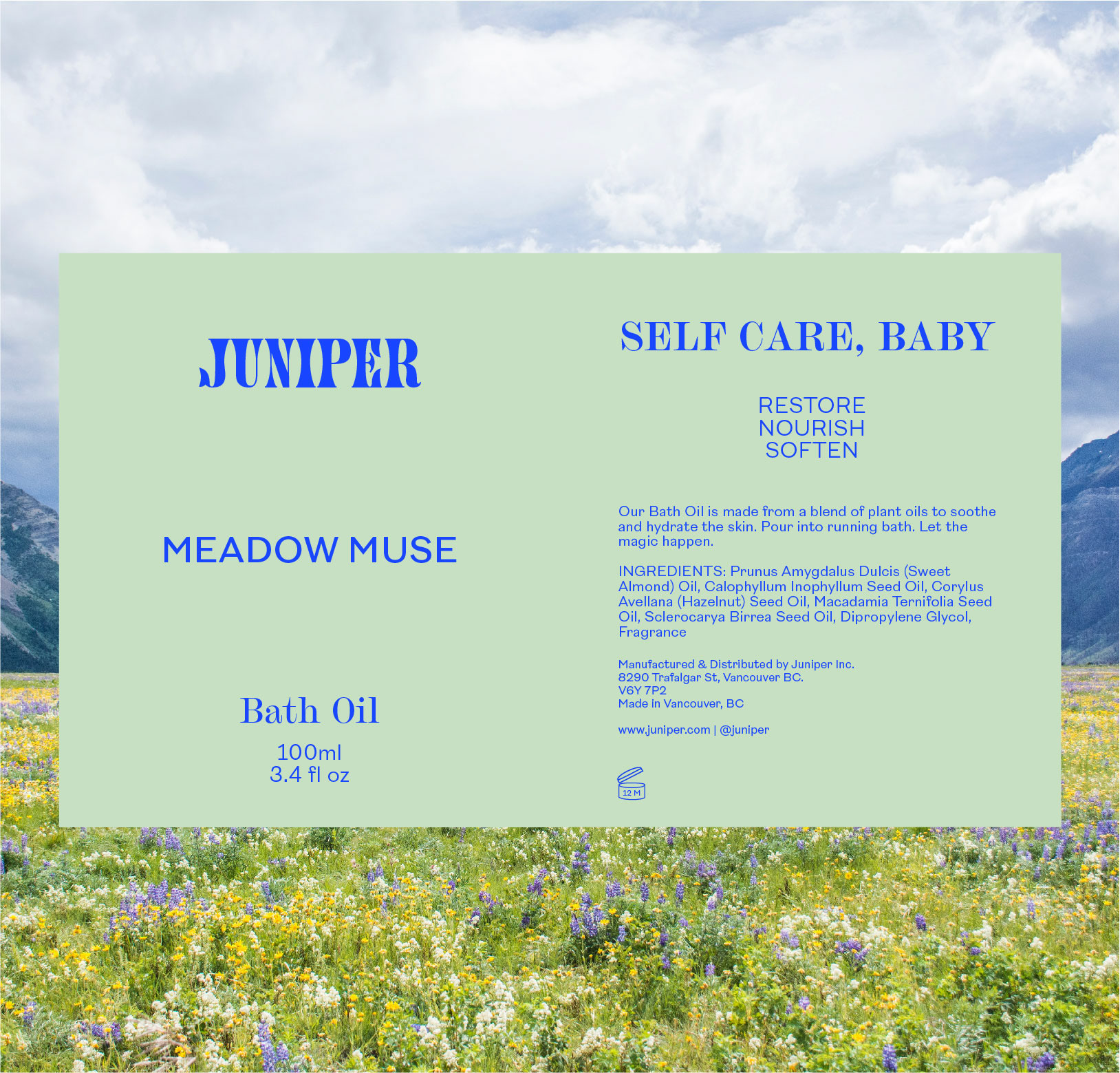
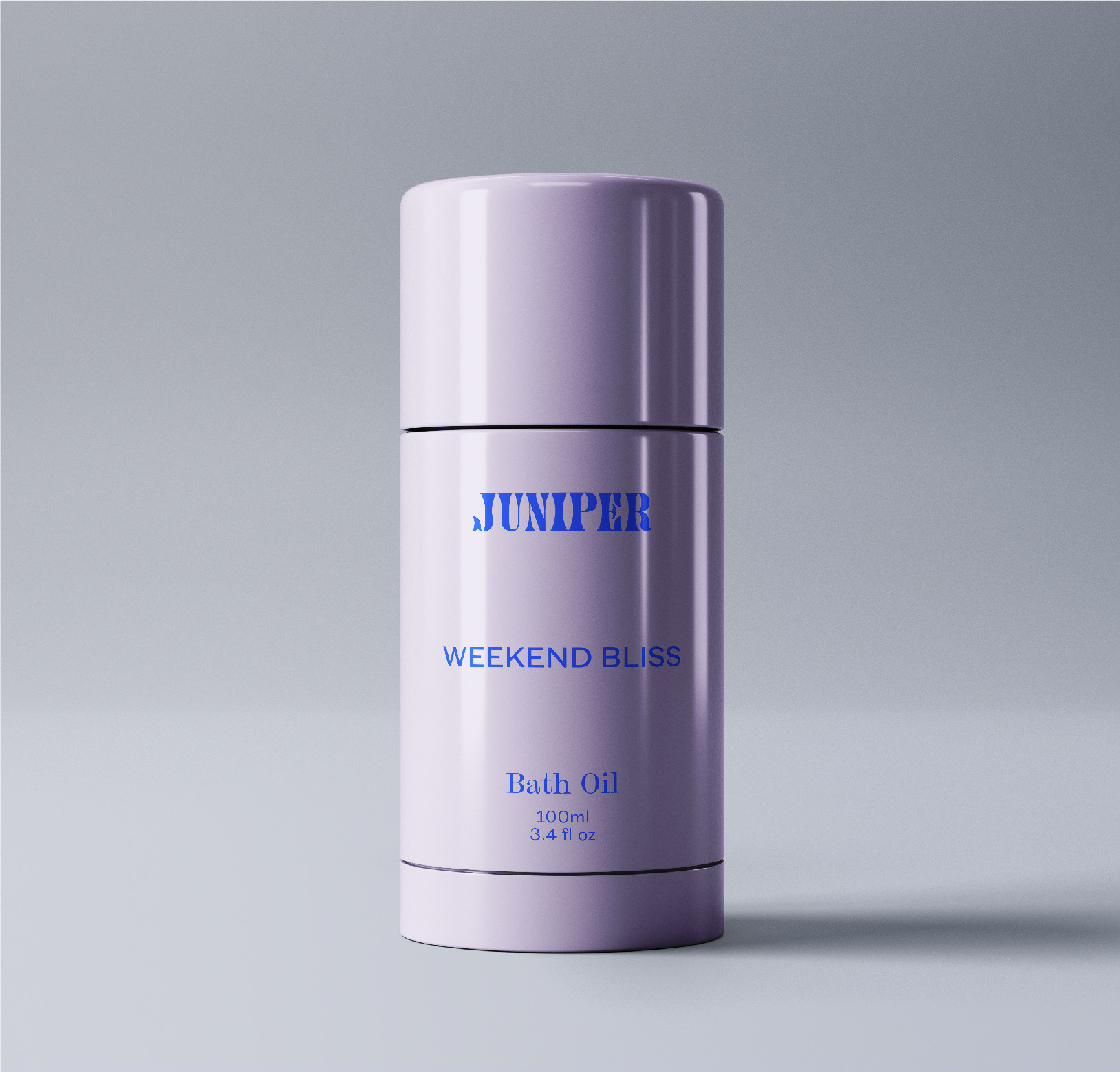
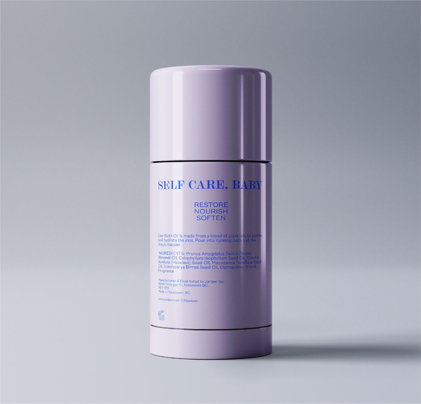
The Concept: We wanted to let the type do the talking with this brand. The presence is nostalgic and spirited while demanding your attention. Juniper brings a contemporary originality to the marketplace.
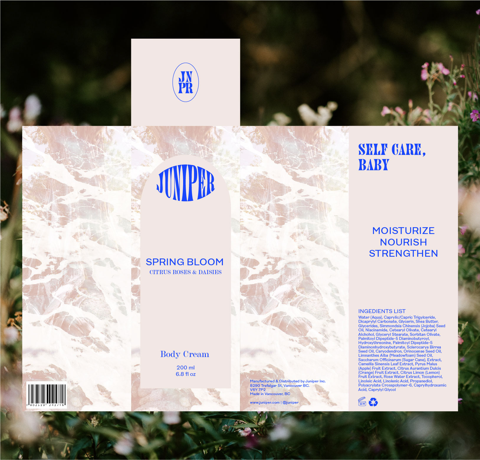
Bright blue was chosen as the primary brand colour because Juniper berries are a blue colour. Creating a saturated, brighter version of this berry blue modernizes the brand and adds a youthful undertone. Soft pastels inspired by the scents compliment this bold blue. Three notable fonts were chosen for this typographic branding in order to create a lasting first impression.
The box packaging features a juniper tree on the sides that is overlaid and treated to give a psychedelic, eye-catching look. Paired alongside this striking creative is a dynamic type treatment that creates depth throughout the brand suite.


The branding leans more on the feminine side since the demographic of consumers purchasing these types of products is mainly females.
The website design is clean and simple for easy navigation with the signature Juniper blue sprinkled throughout to create a cohesive look. Caring for the environment is deeply entrenched in the brand values of Juniper so this was highlighted on the home page of the website.
Juniper’s social media is a further representation of their funky, free-spirited personality. Combining the brand's strong typography with images of nature and product, their social media creates a compelling narrative for the brand at first glance.
Programs Used: Adobe Photoshop / Adobe Illustrator
Images provided by unsplash.com & pexels.com
